import matplotlib.pyplot as plt

import drisk as drSensitivity Analysis for Monte Carlo Models
A percentile tornado plot for a simple profit model
Motivation
Monte Carlo simulation is useful for understanding the overall uncertainty in a model. Sensitivity analysis helps explain which inputs are driving that uncertainty.
This example uses a simple one-at-a-time sensitivity analysis: all inputs are held at their median (p50) values, then each variable is varied through selected percentile values while the others remain fixed. The result is shown as a tornado plot.
Build a four-variable model
Suppose we are estimating annual profit for a small product line. The uncertain inputs are:
- units sold,
- average selling price,
- unit cost, and
- fixed operating cost.
units = dr.LogNormal.elicit(
    lower=8_000,
    upper=18_000,
    confidence=0.8,
    name="Units sold",
)

price = dr.Normal.elicit(
    lower=85,
    upper=115,
    confidence=0.8,
    name="Price",
)

unit_cost = dr.PERT.elicit(
    min=35,
    mode=50,
    max=80,
    name="Unit cost",
)

fixed_cost = dr.PERT.elicit(
    min=250_000,
    mode=400_000,
    max=700_000,
    name="Fixed cost",
)
The model is ordinary arithmetic over distributions. The result is an MCModel.
profit = units * (price - unit_cost) - fixed_cost
profit.name = "Annual profit"
Simulate the output distribution
profit.summary(size=50_000, seed=42)| mean | p99 | p90 | p75 | p50 | p25 | p10 | p1 | |
|---|---|---|---|---|---|---|---|---|
| metric | ||||||||
| Annual profit | 173699.74 | -339067.8 | -149612.4 | -24608.23 | 135901.59 | 329806.43 | 546335.78 | 1032735.62 |
fig, ax = plt.subplots(figsize=(8, 4.5))
profit.plot(ax=ax, size=50_000, seed=42, color="#4C78A8")
ax.set_title("Simulated annual profit")
ax.set_xlabel("Annual profit")
fig.tight_layout()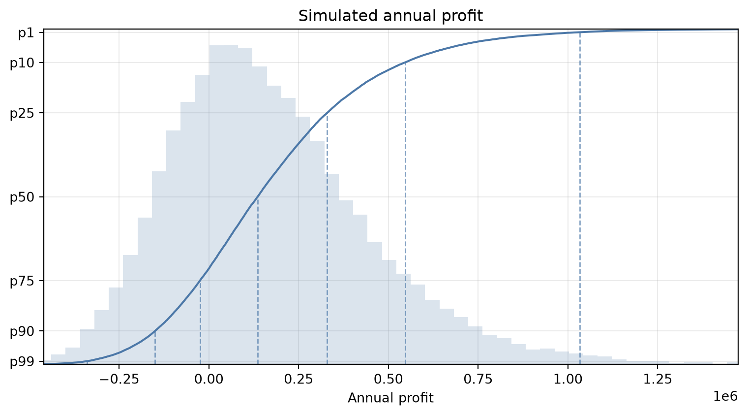
Evaluate sensitivity
Use .sensitivity() to evaluate one-at-a-time sensitivity as a tidy dataframe. By default, drisk uses a standard set of descending percentiles: p99, p90, p75, p50, p25, p10, and p1.
In drisk, percentile labels use exceedance semantics: p90 is the value exceeded by 90% of outcomes, while p10 is the value exceeded by 10% of outcomes.
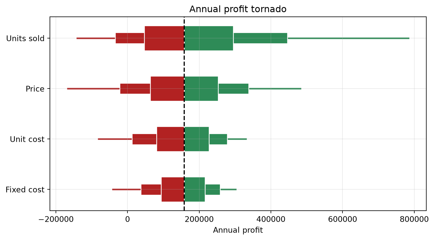
Plot a tornado chart
The tornado chart ranks variables by their effect on the median result. Wider percentile bands are drawn behind narrower ones:
p99-p1is drawn as a line,p90-p10is a thin bar,p75-p25is a thicker bar, and- the centered
p50result is a black dashed vertical line.
fig, ax = plt.subplots(figsize=(8, 4.5))
profit.plot_sensitivity(ax=ax)
ax.set_xlabel("Annual profit")
fig.tight_layout()